


Website Redesign
Overview
Background
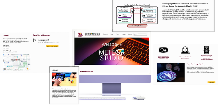
Meteor Studio is a XR lab and studio with a website that is meant to promote themselves, educate visitors on XR technology, and recruit student workers. A redesign was requested by the lab director due to outdated styles and faulty navigation. As a member on the design team, I conducted user testing and interviews to discover core issues and propose a redesign.
Methodologies
-
Heuristic evaluations
-
User interviews
-
User testing
Redesign Goal: Improve user experience with updated appearances, simplified subject matter, and navigation adjustments.

Scope: 3 months, August 2023 - October 2023
Role: UX researcher, UX/UI designer
Toolkit: Figma, Google Docs, Google Sheets, Google Forms
Researching the Problems
Current State
Heuristic evaluation revealed two core issues:
-
Navigation does not work on mobile devices due to overcomplicated interactions
-
Ex. Project cards flip on desktop but not mobile; learn more button is thus inaccessible on mobile
-
-
The design is outdated and has not been updated since the mid-2010's
-
Small fonts, lack of banners, cluttered media
-


Source: https://meteor.ame.asu.edu/projects/ (Aug. 2023)
User interview and testing revealed three core issues:
-
Jargon and page lengths make comprehension difficult
-
Pages on average took 5-8 minutes to read
-
Low confidence in providing summary on material post-test
-
-
White space amount with small fonts strains vision
-
Every user squinted or zoomed into the pages
-
-
A strong desire for search functionality
-
A recurring question: "Can I use the browser search function?"
-

Source: https://meteor.ame.asu.edu/ (Aug. 2023)
Building Empathy with Users
The user interviews and testing phase gave me a better understanding on where someone with an outside perspective may be struggling to accomplish their goals while visiting Meteor Studio online. I focused on their individual goals, backgrounds, and frustrations to help define the core audience visiting the website.
Personas
Based on user studies, the most common people to visit the website were friends and family of current employees, university employees in search of collaboration, and prospective student workers. As such, three personas in these categories were created to ensure the website was redesigned with this core audience in mind.

Changes Based on Needs
The personas helped target features that the website needed improvement on or implementation of in order to reach their common goals. The features included:
-
Updated and the addition of more graphics
-
Simplified project summaries
-
Search functionality
-
Ability to "load more" information when needed
-
Clear contact information
-
Less white space


Designing and Prototyping
Wireframing and Ideation

To establish the user flow of the website, low fidelity wireframes were sketched out. It focuses on new layout methods to better organize the text and graphics on the website and where more could be added to deal with the excessive empty space the users pointed out during testing.
The goal was to make the website feel more visually interesting and simplify technical content.
Client Feedback
After receiving some feedback from the lab director, a few notes were made to address in the final prototype. For instance, some pop ups were removed to avoid navigation issues and clutter. Other changes were more minor and based on preference such as changing the position of certain headings and switching the sponsors for accomplishments on the project pages.

Final Design and Iterations
Iteration - Version 1


The first iteration of the project showed improvements in navigation and layout structure. Complicated interactions to access pages were removed in favor of simple buttons.
However, feedback from the internal design team at Meteor Studio found the design to still feel a bit flat overall, and suggested some spacing and color changes to help improve the appearance as well.
The first iteration also included lower fidelity images since that was what was provided at the moment. The design team requested access to higher fidelity images for the final design.
The project pages were simplified and made immensely shorter to improve reading comprehension across the pages. Rather than include the full summary on each project stage on the page, only the abstract was provided. If users of the website would like to read further into the research conducted for each project, the repositories and publications for each project are provided in the project banner.
Accomplishments were added to the bottom of each project page if they existed. This helps users identify awards the studio has received quickly based on project rather than searching through the News page.


The presentation and publication pages were given cards to better distinguish each one from the other since the clutter on the current state of the website makes it hard for users to read the individual titles and links on the pages.
The cards were made to mimic the new design on the project page to create a better sense of connection and harmony across the website. Previously, each page had a different design for presenting projects, presentations, and publications, making it hard to determine how to search for different topics.
Publications was also renamed from "talks," which some users commented felt made more sense. These pages remained largely unchanged save for the banner photo.
Final Design - Version 2
The final design addressed some changes to the graphics and colors used on the previous iteration and as well as a few layout differences. Hover interactions on buttons and cards were made more simple to account for mobile users, but the website was designed with desktop being the main priority per stakeholder needs. Overall, the website was given a more modern yet simple approach that would be understandable by anybody regardless of level of XR knowledge.

Freedom to Load


The final design focuses especially on giving users the freedom to choose how much information they access and see on a page. For example, publications and presentations similarly allow users to click on a "load more" button either on the top or bottom of the page to load more publications or presentations if the latest posts are not the ones they are searching for.
This same concept applies for the project pages where abstracts are given in place of full explanations so users can opt to view research pages as a choice.
Conclusion
This was certainly a daunting task to take on, but has been one of my favorite design projects to work on thus far. It was certainly difficult to try and condense so much scientific and technical information in a way that made sense to average users who may not be as well-versed in XR technology. However, what made it truly challenging was still retaining enough information to make the client satisfied since they also wanted to be able to refer to the website during presentations at conferences in the future. As someone who worked internally in Meteor Studio, it was an eye-opening perspective conducting user research into how others view our work and website. User research and testing had never been conducted on the website, so many of the issues have been overlooked to some capacity over the almost 10 or so years the website has been active. It was definitely a pleasure to be able to redesign the website in a way that promotes our studio in a way that makes sense to more people.